Tuesday, 16 April 2013

What kind of media institution might distribute your media product and why?

 What kind of media institution might distribute your media product and why?

I feel that my media product could be distributed by a variety of different companies. Also there is also a variety of ways that my magazine could be publish one online and then it could be distributed.  Here are each of the different companies and why i think they would distribute my product.

IPC Media

IPC Media are a huge publishing company, the have over 60 iconic brands. They have multiple platforms across print, online, mobile, tablets and events. They have a main target audience of adults. This helps as one of my target audiences is young adults.
I feel IPC Media would be good for my magazine as i feel they work with similar magazines to mine. The main one being NME.
NME is one of the longest published and most respected in the world. It has been published since March 1952. However it first stared out as a newspaper which then gradually changed into a magazine.  NME was also the first British paper to include a singles chart. I feel my magazine links well with NME as it focuses on the same genre as my music magazine, indie rock. NME has a main target audience for 16 to 24 year olds, which is the same audience for me and my music magazine.


Bauer Media

Bauer Media is a multinational media company which operates in 15 countries world wide. Each week they reach over nineteen million adults in the UK. As well as having more than eighty influential media brands.  6 of the top ten influential magazines in the UK are owed by Bauer Media. The also have online, TV and radio stations.
I feel they will be good for me as they work with Kerrang and Q. Both of these magazines look at rock music so my magazine would fit in well as it fits this genre. As kerrang is aimed at teenagers and Q is aimed at young adults which leaves a slot for my magazine which aims and teens and young adults.

Who Would Be The Audience For Your Media Product?


Who Would Be The Audience For Your Media Product?

My magazine is based around the indie rock genre. Indie rock has been described as a' cult following of younger generation which is striving to be different from pop music'. There main music styles are British punk, Rock and Roll and Heavy Metal. My magazine is also not specifically for any gender as i feel that would limit my audience.
I have chosen to have my magazine focusing on young adults and teens because they are the  age groups who listen most to that genre of music. Another reason as well is because i am also within that age group, so i know what they like and want to see within a magazine. Also because i have an interested in this style of music myself as well.
I feel a typical indie rock fan would be into going to festivals, gigs, photography, being different and having a good time.  I also feel they would be very up to date with also the latest technology so would be on various different social medias such as :


  • Facebook
  • Twitter
  • Tumblr
  • Instgram 

Here is an image of Sky Ferreira i feel she matches the style of what i feel my readers will dress/ look like:

As you can she she has messy hair, ripped tights and looks so careless of what anyone thinks.


Looking back at your preliminary task, what do you feel you have learnt in the progression from it to the full product?

Looking back at your preliminary task, what do you feel you have learnt in the progression from it to the full product? 

From looking back at my preliminary task i can see that knowledge and understanding of Indesign has greatly improved. I feel that i started to to learn more about all the different tools available on there. You can see from my two magazines that because i have learnt more about indesign my latest magazine looks more professionally made. This has also shown me all the work that goes into making a magazine and all the different steps as well as how much experimentation work is done.

Here is my preliminary task front cover next to my music magazine front cover:  


You can see from the two different magazine covers that one is more detailed than the other. I have used the tools available to create more layers so i could add more onto my magazine. For example more cover lines and puff and plugs, I have all round thought and taken in to consideration the conventions of a magazine. 

Here is my preliminary task contents page and my music magazine  contents page: 

As you can tell from my two contents pages the structure of them both are completely different. For my college magazine i used a simple layout, doesn't look like there was loads of complexity to it. Then for my music magazine i went for a different style something that looked more interesting, not so simple.  Also by adding different styles of fonts increases its visual appearance. 

I have learnt from making my magazine how much time and effort goes into the whole process, and that i wasnt as straight forward as what i thought it would be.

How did you attract/address your audience?

How did you attract/address your audience?

For my music magazine i need to address young adults and teenagers. So i need to make things apply to them. 

Front cover


For my front cover I thought I would have the main colours as black and white. This is because I feel it gives it a more interesting   look, stand out because of its simplicity. On my front cover I decided to you two different artists. First one being John Lennon then secondly I used Arctic Monkeys. I have chosen two different style of artists, this was so I could appeal to more people. For the ones who like the old rock and others who like the newer sounds. I have kept everything clear and simple for example a masthead and short cover lines, this is because I know that a lot of young people don't like to read mass amounts.


Contents


For my contents page i went for a very rock based look. I used lots of images of guitars, this creates a clear image of the genre. Guitars are very much commonly played by the fans of indie rock music so it links with there common interests. I also have contained images of festivals as that is seen to be a common thing for the younger rock fans to do.


Double page spread


Indie people are seen to wear vintage and unique clothing, so for my double page spread i had my model we an old vintage jumper to fit in with the genre. I also had her pose in a classic rock position, so people can see and recognise what she is doing. Around the edge of my page i created a floral boarder to match my festival theme.

What have you learnt about technologies from the process of constructing this product?

What have you learnt about technologies from the process of constructing this product?


In the creation of my magazine i used two main programs Indesign and Photoshop. Through the process of creating my magazine i have used these different programs to help create and improve my magazine.The whole time i was making my magazine i was posting updates on blogger as well as different types of research i had carried out. I also used a DSLR camera to take the the images for my magazine. I also used a scanner for getting my work onto blogger. 


Blogger

Blogger was the first thing that i made before my magazine. Here was were all of my research would be collected up and put into. This allowed me to post things then to go back and edit them as many times as possible. It also was useful in being able to look back at all the steps for making my magazine. Blogger is also useful as i can access it fast and easily for any computer.


                                                                                                                                   Indesign
Indesign was the main program i used. It is the bases of my whole magazine. Indesign is used in the professional world for creating there magazines. When i first started using indesign i found it hard to use, however as time and practise cam thing because easier and i started to find out all the different things i could do with it. It was very useful when it came to constructing my magazine as it allowed me to move things around freely and easily.


Photoshop 
Before adding my photos to my magazine i would need to edit some of them in photoshop first. for example if i needed to get rid of a background i would edit out. I also came in useful for sharpening up my photos as a few came up slightly out of focus. 


                                                                                              Camera
For all of my images i used a DSLR camera, i found this useful as it allowed me to take lots of different photos. It also was easy to upload photos from the camera to the computer.


Apple mac computer 
 All of my work was carried out on mac computers. This was good as everything was fast as it was all up to date software. I found it easy to use as well as i was used to using this software.  

How does your media product represent particular social groups?

How does your media product represent particular social groups?

For my music magazine i decided to focus on the genre indie rock. I found out from doing my research that that majority of people who read this style of music are aged between 16-23. So i need to make sure my magazine suited the style of genre as well as the say group.  

Front cover

For my front cover i  chose to dress my model up with heavy eye makeup, give her wavey hair and to have her wear a floral head band Firstly i had her with heavy eye make up as lots of old typic rock bands all had big dark eyes, this also helped give the image a bit of edge to it. Her hair is all wavy and messy as if its not in control and does what it pleases, this links with the types of fan indie rock music has been linked to.In my models hair i got her to wear a big floral head band, this give it quite and individual style. When taking the photo i used lots of shadows to keep her face shadowed out so you couldn't completely see her. I did this to show that you could see her but not completely, this links with some of the style of how indie rock fans dress some people don't completely under stand why the dress or do the things the way they do. People don't get the clear picture of there style just like they don't get a clear picture of my models face.


Contents page


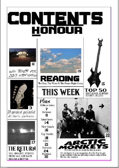
For my contents page i have used taken four images. Two of my photos where taken of guitars. In indie rock music guitars are the most popular instrument used, so i thought it was a must to contain at least on image of one. I took each of the photos at different angles one straight on so you could see the whole guitar, and then another just showing the head and neck.  I was lucky to of gone to a concert at the time of making my contents page so i could get an image of the stage. This was good because lots of rock people attend lots of different festivals and gigs, they're very supportive of the bands they like. I then took a picture of the sky on a moderately sunny day, this was to go with my festival article.


Double page spread


For my double page spread i got my model to create a typic indie rock pose. This pose is iconic and a soon as you see it you know the style of person they are. Also to go with the indie style i had her wear an old vintage jumper. Also the indie genre is know for being different so i decided to use a floral boarder to create more of an individual look.

In what ways does your media product use, develop or challenge forms and conventions of real media products?

             In what ways does your media product use, develop or challenge forms and conventions of real media products?

Before i started to create my music magazine i need to see what conventions where typically used Indie Rock magazines. The reason why i was focusing on Indie Rock magazines was because this was the music genre i wanted to aim my magazine at. So my first step was looking at there front covers and analysing what conventions where common in all of them. Here are some of the magazines i looked at:


  1. First thing they all had in common was that they all had a clear Masthead.
  2. Secondly on every single one they has somewhere on the page a related artists name in bold on the cover.
  3. There is either one or two main people as the cover image.
  4. They all contain some puff and plugs, using the left third. 
  5. Each of the also stick to a specific colour scheme.
After completing my research i then went into creating my music magazine front cover, remembering to apply all the research information about conventions into my work. From doing the research task it will help me create a more professional looking magazine as it followers the trends of whats already out there on the market.


  1. So from seeing from my research task that all the magazines had titles which where easily recognised i new that was a must for my magazine. I chose to have the title as 'Honour' as it was simple and easy to read. As well as it being easily recognisable on the page and it would be no matter where it was placed on the page.
  2. Next thing to add was some related artists in bold. I chose to have two artists names on my front cover to help make my style of magazine even clearer. I kept one of my artist down the left third and to match my research i had another one in the middle of the page.
  3. For my front cover i had a girl hold up a sign with a John Lennon quote on because on all of the covers i research they all had a celebrity to match the artists names they had on there covers so i need to have a picture that related to the artist name. 
  4. Pretty much no matter what magazine you look at they will all contain some puffs and plugs on the page. So i decided to contain theme related ones such as the chance to win free festival tickets.
  5. For all magazines its important to have a colour scheme. This is because it keeps the magazine looking good, not a mess and everything all goes well together. I decided to go with black & white as the main colours but with a hint dark red just to stop it looking so dull.


After making my front cover i then need to look in to contents pages. So the same process of looking at front covers i did for contents pages.


  1. First thing they all contain is the title of there magazine  along with somewhere on the page it says 'contents'. 
  2. Different article sizes/ columns 
  3. Images


My Contents page after looking the research.


  1. I wanted to my title as well as 'contents' both bold on the page, just so it was clear. i put 'contents' on top as it is the most important for this page. I also kept both of the fonts the same.
  2. On my contents page i have made some articles larger than other. I did this to the article which where on the front cover as well as articles which i think people would be more interested in reading. Just like some of the contents pages i researched i decided to have my articles divided into 3 columns. I did this because i feel it makes everything clear to read and looks the best. 
  3. While doing my research i found that most contents pages had either one big main image or lots of little ones. I decided to go with lots of little ones as i feel i didn't have an image good enough to sum up everything. Also i think it looks better. Also with each image i put the page number in the bottom corner.

My final research task was to look at double page spreads.


  1. Image Taking up over half of the page
  2. Bold titles 
  3. Pull quotes 
  4. Drop letters
  5. Colour scheme 
  6. Page number


My double page spread after apply the conventions: 


  1. From my image i didn't want to have it taking up over half the page because i would have enough   space for all my writing. I already lost a lot of room when i created a boarded for the page. However the photo still does take up a lot of the page anyway.
  2. Like most of the magazines i looked into they all contained a bold title. So i decided to have my title to spread across half the page, this make it easily stand out.  
  3. In the majority of the magazines i say they all had included a pull quote.  They are good to use as they give people an insight into what is included within the article. I also like to use it as it broke up the columns so it didn't look so repetitive.
  4. It is a very common thing for double page spreads to contain drop letters at the stat of paragraphs.  However i felt my text didn't need it and if i did include it it would clutter up that area to much. As it already included my photo and title. 
  5. Through out all magazines you should always stick to the same style of colour scheme. This helps the magazine to all flow together so it looks as it its all as one. 
  6. The page number is a must as it allows people to flick through a magazine to the right page instead of having to look at each page individually. 


My Music Magazine Proposal, Initial Ideas & Flat Plans

Proposal 

I have firstly chosen to aim my music magazine for teen and young adults. I have decided to aim it for this audiencs as I wanted to have a mature style for my magazine. I also want to aim it for the upper class audience.
The genre for my magazine will be indie rock. I chosen this theme as I felt that there was many things that I could include and elements I could add. Also because the genre of music is known for having a unique edge to it I know I could have something different on my magazine and it would fit. Another reason is that indie rock music is very current in today's society, so it will have interest for a large audience.
For my front cover I wanted to keep it simple yet interesting. I have decided to have the main colours as black and white, this helps keep it classy. Also because the majority of music magazines are full of bright colours, when on the self my magazine will stand out as it will contrast with all the others busy coloured magazines.
For my coverlines I had the ideas of having then as something interesting yet to the point. For example just names of the artist featured, trying to keep the audiences interested. Also by having short cover lines it doesn't clutter up the cover making it look unprofessional. Also it keeps focus on the main areas.
Also to add Puff and Plugs saying what could be won inside the magazine, attract more attention to my magazine.
For my title I have come up with the name 'Honour'. I hav chosen this as in the indie rock genre there are a range of contempary and new artists, so we should honour the new and the old.
For my title I wanted to use the idea of having it as like a scrap book. So I have the writing in bold with a black box around each one, this style is feature in lots of indie rock magazines. It also helped with my black and white theme, as well as making it stand out.  For the cover lines I wanted to use a plain standard font, just to keep it simple.
My music magazine will be published in the summer/spring season. I have matched my main cover image with this theme. I have got a girl dressed with flower in her hair holding a sign saying 'Make Love Not War'. The flowers in her her represent the sun of Summer as that's when most flowers are out.
To get my main cover image I set up a photoshoot. I used a plain white back drop and took the photo with the flash on. This helped soften then facial features making the attention being less on the face and more on the sign she is holding. The quote on the sign is a song title of one of John Lennons songs, who he also features within the magazine.
My music magazine will be posted seasonally. This is because I don't want to publish it to frequently with not much information in as not much can happen in one month.  Also it will help with making appropriate themes for each issue.
The dimensions for my magazine will be A4 as that is a good enough size so everything can be fit on the page without being cluttered.
For my contents page I am going to stick with the black and white theme. However I will used coloured pictures as I don't want my magazine to be to bland.
For my double page spread i want to put more colour into it however still have black and white as the main colours. I want to add more colour just so my magazine doesn't get to bland and boring.


Initial Ideas 


Flat Plans

Here are my flats plans for my Front cover, Contents page and Double page spread. They show my first initial ideas of how i would like my magazine lay out to be.


Possible covers

Possible Front Cover Photos

To being the process of making my magazine i need to set up a photo shoot to get the images i wanted to include in my magazine.  To do this i first need to choose on the style of magazine i wanted to create. I'd chosen to create an indie/rock magazine. From this i need to plan how i was going to create that genre of music through my photos. I need it to be clear straight away what genre of music it was so when people are trying to pick the magazine they new clear immediately what style it is. 

Because my genre of magazine was indie/rock i new my magazine cover need to have a different edge to it, something that made it different to the rest. 


I like this photo because it was easy to look at. Also the quote is from John Lennon who is in the Rock genre so it links well with my magazine. Also because its all in black and white it keeps it simple. So when i come to putting titles and cover lines it wont look to busy and unprofessional. 
This photo would be good because its giving an alternative look with the horns. I edited this photo because i found it to plain before. I chose to add horns as i feel it could work well with placing things around it. for example having my masthead going in the slot at the top between each horn.  So it links with the indie genre as they are seen to be alternative.
With this photo its good because of the guitar so it helps keep the genre of my magazine clear, however the background would make my front cover look to busy. So it would be hard to place things around as it could clash with the background.

Analyse On Double Page Spreads


Analysed Double Page Spread


This is a double page from the magazine 'NME' all about music artist Lily Allen. On this page it features a large image of Lily taking up a whole A4 page on the right hand side it, the image is a mid shot only showing her up to her waist . The images shows her wearing a bright checkered shirt. This works well as the colour scheme for the rest of the page its black & white so it stands out, making the first main focus of the page on her. She is also wearing heavy dark make up which signifies the style of person she is. It is also relevant to the rock genre of 'NME'.  Also because the background is plan it takes no focus away from the image. Keeps all the focus on her.

The head line of the spread is in bold with a black outline around it, there are also some letter bigger than others this will attract readers as it stands out more. It also takes up a lot of room  making it one of the main focused of the page. The head line is a quote so it can give a slight insight into what can be found within the article below.

Through out the whole double page spread they have only used 3 types of font. One for the title one for the subtitle and one for the article. The article is kept neat in 4 column, this helps keep the information clear and easy for the reader to read.

By having a sub heading it gives the reader an insight into what can be found in the article, sums up what can be read below. It is also a different front and size to the masthead still making it stand from the article but not as much as the title.

My Music Magazine Double Page Spread

My final Double page spread
I had chosen to do my double page spread on a festival review. I decided this as i feel i could pick a festival with was indie rock so it would match my genre perfectly. 


 The Process Of Making My Front Cover


                           Step 1
The first step for me was choosing a right boarder. From the start i had always wanted to have a floral border. This is also why i chose to do a festival review as the flowers would link well. I like the way my border came out i feel it provides a nice summery theme and boosts it in colour so the black and white doesn't become to repetitive.


                         Step 2
The next stage for me was fitting in my title. I need to think about where i placed it on the page so it i didn't clash with the spacing of my writing or photo.


                    Step 3 
The next step was for me to find a photo for my double page spread. One that linked with my music genre, festival theme and could be placed on the page well.Here is the original photo i took:
However because the background of my double page spread is white i need to edit out the background so i would fit to the page. 
Once that was done all that was left was to put in on my spread, making sure it was in a suitable slot for when i added text on to the page.

                       Step 3
The last thing that i needed to do was to type up my writing and then place it onto my page. I decided to have my writing in 3 columns going down the page as i thought this layout looked most professional. 


My Music Magazine Contents Page

My final Contents page

This is my final finished contents page for my magazine. I am very pleased with the outcome of it.


                                                The Process Of Making My Front Cover
Before i started creating my contents page i wanted to look into other magazines to see what they have done. I looked at magazines such as MNE and Q for inspiration.

                          Step 1
The First step in creating my contents page was to get out the main template for my page. Getting a rough outline for where everything should be.
When creating this first step i needed to pick on a Contents title. I collected up my 3 favourite titles the selected one from the chosen list: 


                      Step 2
The next step was to start to add in my information. I need to take more photos which was to go on the cover. When taking my photos i need to make sure the linked with my genre and the theme of the article they where linked with.

                   Step 3
     After i had put all of my photos on the page i need to make sure i had all the things a contents page should include, such as links to my double page spread, other pages in the magazine and information that was on my front cover.
When writing the what else was in my magazine i need to make sure that it was all themed related or it would be unprofessional and not appeal to my selected target audience.

  When also creating my contents page i need to make sure all of my page reference numbers matched and linked up. To make sure i hadn't put the sam number twice.

My Music magazine Front Cover

 My final front cover


This is my final music magazine front cover after all of my edits to it. I am pleased with they way it has come out, i feel that is portraying a clear genre (indie/rock)


The Process Of Making My Front Cover
First i started off by doing research into the typical indie/rock magazines. I wanted get a feel for what style and techniques they use. I was going to use the information i gathered to help influence my work. 


Steps To The Creation Of My Front Cover
                           Step 1
The first step was choosing a main cover photo from my photo shoot.
                           Step 2
The next step was for me to choose a suitable font for my title. I had to pick from a range of styles i liked the most.


I tired out each title out to see which one suited well and looked best with my cover photo. Once i had made that choice i had to place it on my cover in to most suitable place.
I found this title worked well as it was big and bold, making it clear that it was the masthead. However it was to over powering that it took all the attention away you still noticed everything else on the page.

                                Step 3 
Adding in the essentials. Every magazine must contain a barcode, price, date and issue number. I felt for my magazine it would be best suited in the bottom left third of the magazine. I also put it there because if it was on the shelf in a shop that would be the side see and its important for people to know the price of a magazine.  Also to see what issue number it is so they can see it they already have the copy or not.
                            Step 4
My next step was to add in my cover lines. I need to remember to include one which lined to my double page spread. The whole time i was adding cover line i need to make sure that they where all genre related. Otherwise it would be unclear of my magazine style and not be aiming at the right target audience. 

                         Step 5
The next step for me was adding in more picture and puff and pugs to make my magazine more interesting and convincing for the reader to buy. Also i need to include more as with out it my front cover would be to bland and boring. I had the lay out of my magazine fit for the selling process. i had most of the prizes and what can get in this magazine don the left third. I picked to have one of my puff with a dark read background, this made it stand out because it was contrasting to the black & white of the rest of the front cover.