Before Starting to create my magazine i wanted to put down all my ideas and thoughs , this was so i didn't forget anything and then go through process of illumination to conclude what my best ideas are. This will then help me finalise my ideas and see the development from my first ideas and final product.
Flat plan
This shows a ruff draft of my front cover and contents pages.
 |
| Front cover |
 |
| Contents Page |
The main Target audience for my Magazine is specifically for students who attended South Down's College.This is mainly due to the content that will be included in my magazine. For example recent college news, things that have happened with the college that is felt should be recognised and what students will be interested in. It will also include up coming events and all the information about them such as student nights, but mainly important exam dates. There will also be lots of advice pages including many topics such as health, social, university and parenting. It will also provide students with many study tips and advice on how to make a study timetable to help the achieve the highest grades possible . Through out he magazine there will be photos of previous events for trips, photography students work and anything else. Each issue will contain a listing of all the term and bank holiday dates.
For my title i have chosen to call it 'Clique' with them 'iq' in a different font. I chose this as in college there are many different cliques of people, lots of diversity. I previously had the idea of something like 'College Life' however i found it to be plain and wasn't very catchy.
For my cover line i had the idea of having something that was reverent for this season issue, for example top tips to get hot exam results.For my font i have chose to use 'Bold Italic' as the main base. I chose this as this font is very clear to read and it stand out. Then for the 'IQ' i used 'chalkduster' this is because it has clear distinct contrast with the rest of the title
I have chosen not to use tag lines and i feel it will make the magazine cover to busy. As i want there to be lots of focus on the image. Also my magazine will look to unprofessional if its to cluttered.
My magazine will be published seasonal, for this issue will be published in the summer.So i will use lots of bright colour. The contents inside will also match the season , for example font colour and the layout. Aswell as the pictures they will all be relevant to the season.
My magazine dimensions are going to be portrait as it fits my cover image better. The size of my magazine will be A4.
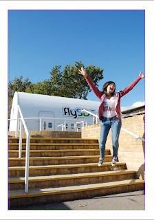
The front cover of my magazine will be a student jumping outside, with the weather bright with blues sky. This will imediatly represent summer as the weather will be good and the fact that the student it out side. To get this image i will find someone who is willing to jump joyfully of some stairs. I will also pick a day where the wether is pleasant and has clear skies.
Then for my contents page i will have a mix of photos some of art work, some of students and some of the campus this will give a show of what images can be see through out the magazine.
Final Front Page
This is my final product which i made on InDesign.

Steps into making my magazines

Final Contents Page


Hi Fenella
ReplyDeleteI really like your front cover and it works well. I think we should have a chat about the coverlines as they could be more punchy to make them more enticing. I also think that the font is a little bland. It just needs a few tweaks.
I'm not so convinced about your contents page although I do like the design on the side.
ReplyDelete