Tuesday, 29 January 2013

Music magazine research on front covers

                                             Music Magazine Research On Front Covers

The music industry has a vast range of genres which are listened to by people all across the world. There are separate music magazines for each genre aiming at different audiences. With  music magazines they have to work hard to put across the genre of music they are as the readers are unable to listen to the music through the magazine. So it is vital for the editors  to used the right images, font, layout and style.

The music magazine that can be see today all include the key conventions. Such as on the front cover they would include a masthead thats relates perfectly to there magazine genre. Another main thing that is common in all music magazines in they usually have a photo of a relevant artist on the front, where there music would be featured in the magazine. A swell as using an appropriate colour scheme.

Examples of different magazine genres :


Here is an example of a popular classical music magazine. It has used the main conventions for example they have used a famous conductor. Straight away from this image you can see that the genre is classical because of the piece of equipment that is being held. However they have only included one photo  on the cover this helps keep the magazine simple and to the point.
Down the side of the magazine they have included things that are coming up within the content of the magazine. This helps interest the reader drawing them into want to read more.
The colour scheme of this magazine is quite dark all blacks white and reds.
The font on the cover is all quite plain, this gives a sense of control.
They have also used puffs, at the top of the magazine the have the BBC logo staying thats its the worlds best selling classical music magazine.This magazine is aimed more for people aged 45 + due to the the fact it is more sophisticatedly presented.


In this issue of Kerrang they feature on the front cover a photo of Hayley Williams, from the band Paramore. The image of her acts as the background for the magazine cover. They have also used lots of bright lively colours. This shows that the magazine is aimed at the younger generation. The Fonts used on this magazine are all big and bold. Also The title 'Kerrang' is all shattered like its been broken. This portrays madness which links to the type of audience they are trying to appeal to. Because they are aiming at a younger audience they have kept the writing on the cover very minimal, and instead used lots of relavant pictures. This helps draw in the attention as there are lots of this to look at making the magazine stand out.


The genre of NME magazine is indie/rock aimed at teenagers to young adults. The main cover image is of Florence An The Machine, they way in which she is posing helps show that this is for a younger audience. They way she has her legs on show wearing only minimal black clothing. They way the photo of her is taking up the majority of the front cover gives the readers an insight of what style of music magazine it is. The colour scheme in on this cover is red white black and yellow. All these colours are quite bright which helps appeal to the younger audiences. Also because the colours are bold it links with the rock genre as rock players are all know to be quite bold and confident. The use of read in the colour scheme also helps link to the image of Florence as she is iconicity know for having red hair.   There is an even ratio of pictures to writing, this also helps show why it is for more older teenagers.


Music Magazine Research On Contents Pages

                                                Music Magazine Research On Contents Pages 

Contents pages are curial for all magazines, they tell you whee to find what and whats in the magazine

Examples of different magazine contents pages:


Mojo contents page has a very clear layout. It easy to understand and to locate. It makes it easier for the reader to pick out what they want to see when the design is nice and clear cut. This is helped by the use of simple colours used. The writing is in standard black with sub headings  in red which make clear separations. They have also included photos that link well to there genre, they put them together in a scrapbook style. Also the colours of the photos contrast well with with the white and black main colours scheme. And because the photos are a variety of sizes it also helps bring to attention towards them.
At the bottom of the page of comments from people who work at the magazine. This also is another good visual point for the reader, gives more interest.


On this contents page they have chosen to include a photo of a well known artist, Kanye West. Straight away from having a photo of him there you know there will be something that is revenant to him with in the magazine.
The colour scheme for this page is effective. They have used mainly black, grey and white. Then used a shot of head in the heart being held. This immediately bring our attention over to it as it is such a contrast to all of the other colours on the page. The content of the page has been written in a unique style. The style of font they have chosen to uses makes it look professional and stand out. However they have kept the page quiet plain which i think is effective as it highlights all the important parts of the contents page. It also makes it clear to read and understand.


The contents page for Q magazine is quite busy, theres lots of writing and images. People tend to like the look of things that have lots on it as they feel they are getting lots for there money, this will help increase the sales for there magazine. When you first look at this page you notice the main image of the band, then under the photo they have included the page number for the artical on them and a pull quote.   The main colour scheme for this contents page is red, black and white. These colours are good as they don't draw your attention away from the main images and subheadings.

Music Magazine research Target Audience

                                                 Music Magazine Research Target Audience 

There are a vast range of music magazines out in the world, each specifically made for different genres and age groups.

Here are some magazines and who there target audiences are:


NME reaches its target audience in different ways.  Such as the genre of the magazine is give straight away by the artist on the front. You know then from the type of music Tyler The Creator performs the audience its aimed at, teenagers & young adults. Also The fonts are bold and bright and easily read which appeals to the younger generation as they are stereotypically know not to do as much reading. Also the fact that there isn't much writing on the cover at all, and it includes swearing.


Kerrang is a rock music magazine aimed at 18 to 25 year olds.  The cover of the magazine used a variety of dark colours such as black, this give the magazine a dark gothic feel. The main image on the cover has a person smoking, because smoking is illegal for people under age it also aims for young adults. However it doesn't appeal hugely to the the older generation due to the type of music genes they are.  Kerrang music is very loud and it says on the top left hand side of the magazine ' Life is Loud' older generations mainly go for quitter more claiming music.


Also on the right hand side of the magazine there are puff with offers in, saying that inside contains free posters. This also appeals to there target audience as they are more likely to stick the posters up in there rooms.


Blender was an American music magazine. It included lists of albums, artists and songs. In this issue of Blender they have used Taylor Swift as the main cover image.  Taylor Swifts music is country and pop. Because she sings pop music her target audience is mainly for young teens. From this you can tell immediately that the magazine is going to be mainly aiming at that target audience.

For example down the left third of the magazine they have described her as being the 'Boyfriend Trashing, Radio Ruling Girl Next Door'. The wording they have used helps aim it at there audience. Such as ' Boyfriend Trashing' shows it being as slightly immature.

The colour scheme of the magazine is quote bright and simple so it also gives the magazine a more mature side to it.   Aiming it a a wider audience.

Magazine Analysis

I have chosen to analyze Kate Moss's  cover of vogues. I have analyzed  all the codes and conventions of the magazine cover. Picking out the main point which is essential in having a magazine cover.


  • Masthead- The masthead of the magazine is the title Vogue. Vogue is very well known in the fashion industry from its models and designer label, and is available all around the world. It is seen as an upper class magazine.   
  • Main Image- The main images of a magazine is commonly a celebrity. Kate Moss is the celebrity featured in this months issue of vogue. Kate Moss is a very well known model and is very influential, this immediately give the magazine a large interested audience as many people are interested in her work.
  • Date line - The date of this issue of Paris  Vogue is June 2010. The main image of the cover is Kate Moss in the sea, this matches with the date issued as the season is summer.
  •  Left third -The left third of a magazine is one of the most important sections. Its the part of the magazine that will be on show when on the shop shelfs. This is why magazines focus a lot on what they put on  that section making it stand out from the rest, what encourages customers to pick there magazine from the rest. On this issue of Paris Vogue they used bold writing that immediately draws you in. Also the cover picture section that is show is showing half a hand and a beach, and because vogue is know for having famous models people will be intrigued to see who it is.
  • Price&Barcode-  With each magazine it is vital to have a price and barcode.
  • Colour scheme- The colour scheme for this issue is summer colours. so you have the blues and golds in the picture. Then the page writing is white and black, this keep the magazine looking glassy and not tacky.

Tuesday, 15 January 2013

My College Magazine

Initial Ideas 
Before Starting to create my magazine i wanted to put down all my ideas and thoughs , this was so i didn't forget anything and then go through process of illumination to conclude what my best ideas are. This will then help me finalise my ideas and see the development from my first ideas and final product.

Flat plan

This shows a ruff draft of my front cover and contents pages.

Front cover

Contents Page
Proposal 

The main Target audience for my Magazine is specifically for students who attended South Down's College.This is mainly due to the content that will be included in my magazine. For example recent college news, things that have happened with the college that is felt should be recognised and what students will be interested in. It will also include up coming events and all the information about them such as student nights, but mainly important exam dates. There will also be lots of advice pages including many topics such as health, social, university and parenting. It will also provide students with many study tips and advice on how to make a study timetable to help the achieve the highest grades possible .  Through out he magazine there will be photos of previous events for trips, photography students work and anything else. Each issue will contain a listing of all the term and bank holiday dates.
For my title i have chosen to call it 'Clique' with them 'iq' in a different font. I chose this as in college there are many different cliques of people, lots of diversity. I previously had the idea of something like 'College Life' however i found it to be plain and wasn't very catchy. 
For my cover line i had the idea of having something that was reverent for this season issue, for example top tips to get hot exam results.
For my font i have chose to use 'Bold Italic' as the main base. I chose this as this font is very clear to read and it stand out. Then for the 'IQ' i used 'chalkduster' this is because it has clear distinct  contrast with the rest of the title 
I have chosen not to use tag lines and i feel it will make the magazine cover to busy. As i want there to be lots of focus on the image. Also my magazine will look to unprofessional if its to cluttered.
My magazine will be published seasonal, for this issue will be published in the summer.So i will use lots of bright colour. The contents inside will also match the season , for example font colour and the layout. Aswell as the pictures they will all be relevant to the season.
My magazine dimensions are going to be portrait as it fits my cover image better. The size of my magazine will be A4.
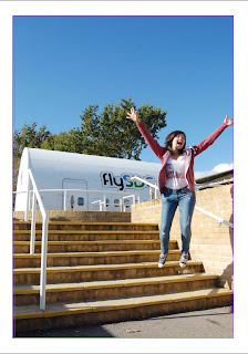
The front cover of my magazine will be a student jumping outside, with the weather bright with blues sky. This will imediatly represent summer as the weather will be good and the fact that the student it out side. To get this image i will find someone who is willing to jump joyfully of some stairs. I will also pick a day where the wether is pleasant and has clear skies.
Then for my contents page i will have a mix of photos some of art work, some of students and some of the campus this will give a show of what images can be see through out the magazine.


Final Front Page 

This is my final product which i made on InDesign.


Steps into making my magazines


Final Contents Page